We don’t
do Neutral
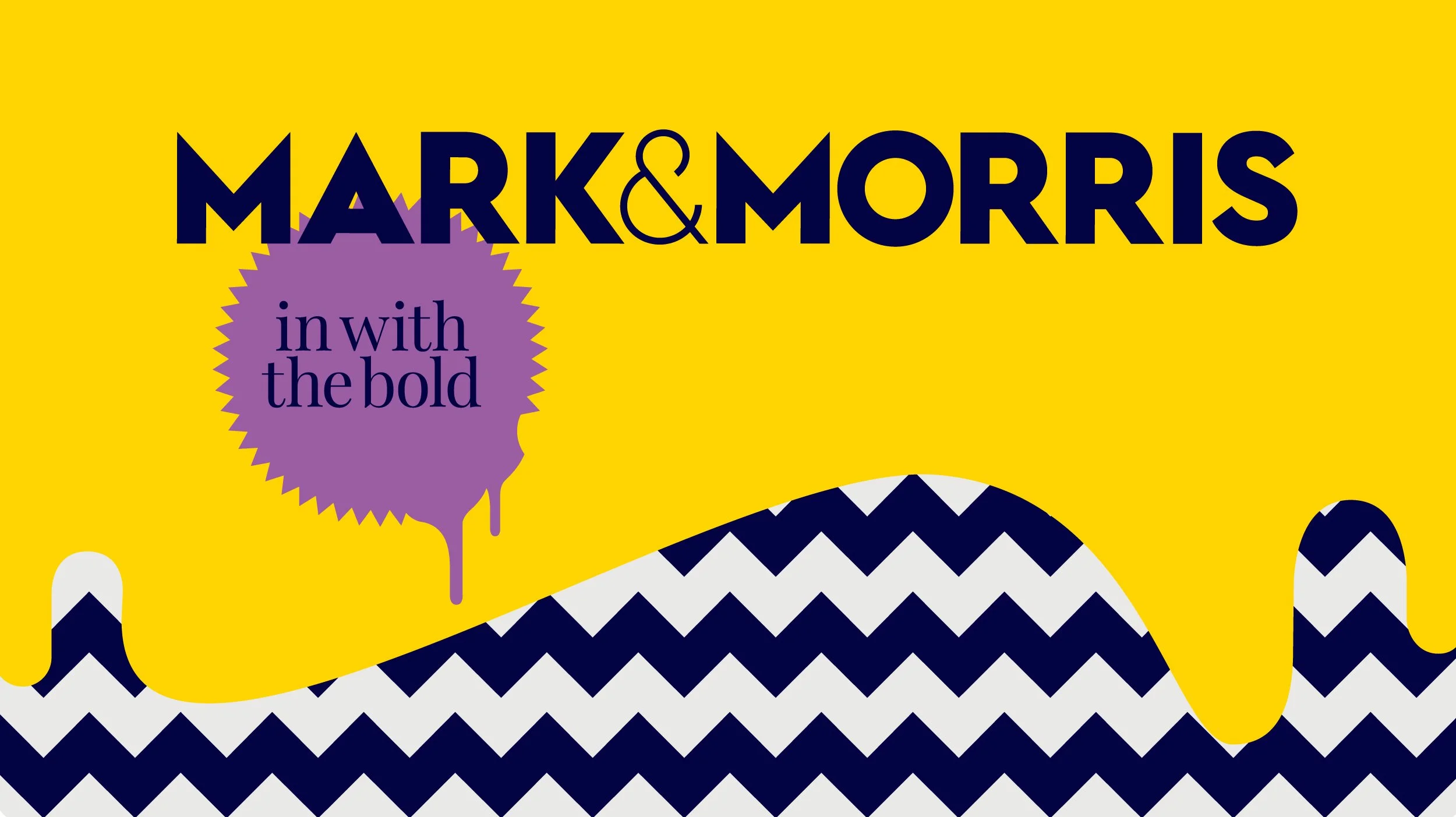
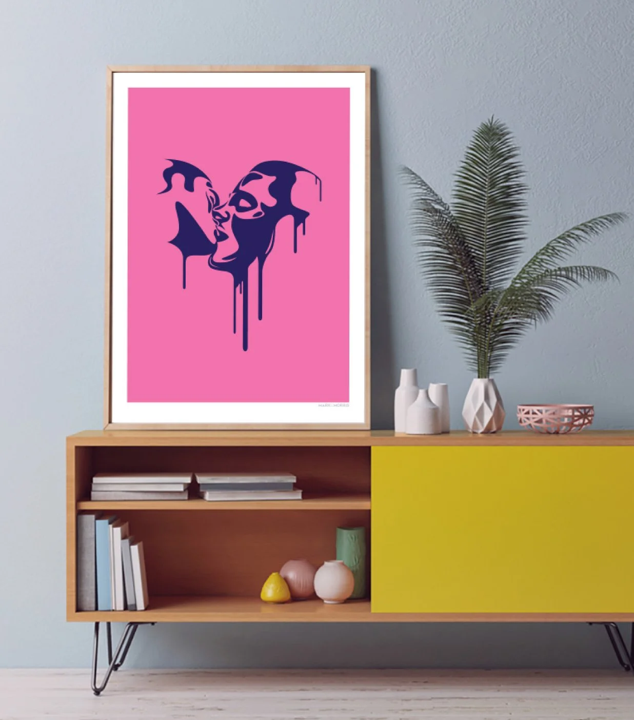
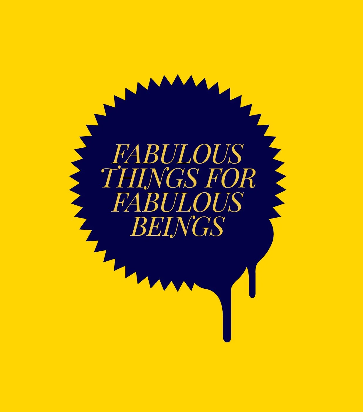
The homewares and print market is awash with tasteful neutrals and safe palettes. For the LGBTQI+ community, a market of bold, expressive, and design-savvy consumers, there was a glaring gap. A space where colour wasn't an accent but a statement. Where the art on your wall said something about who you are. Mark & Morris was created to fill exactly that gap, and it needed a brand identity to match its ambition.
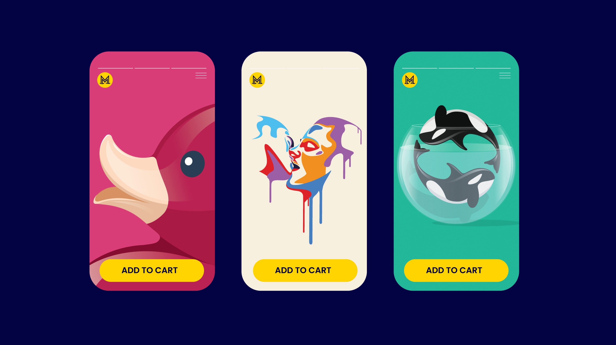
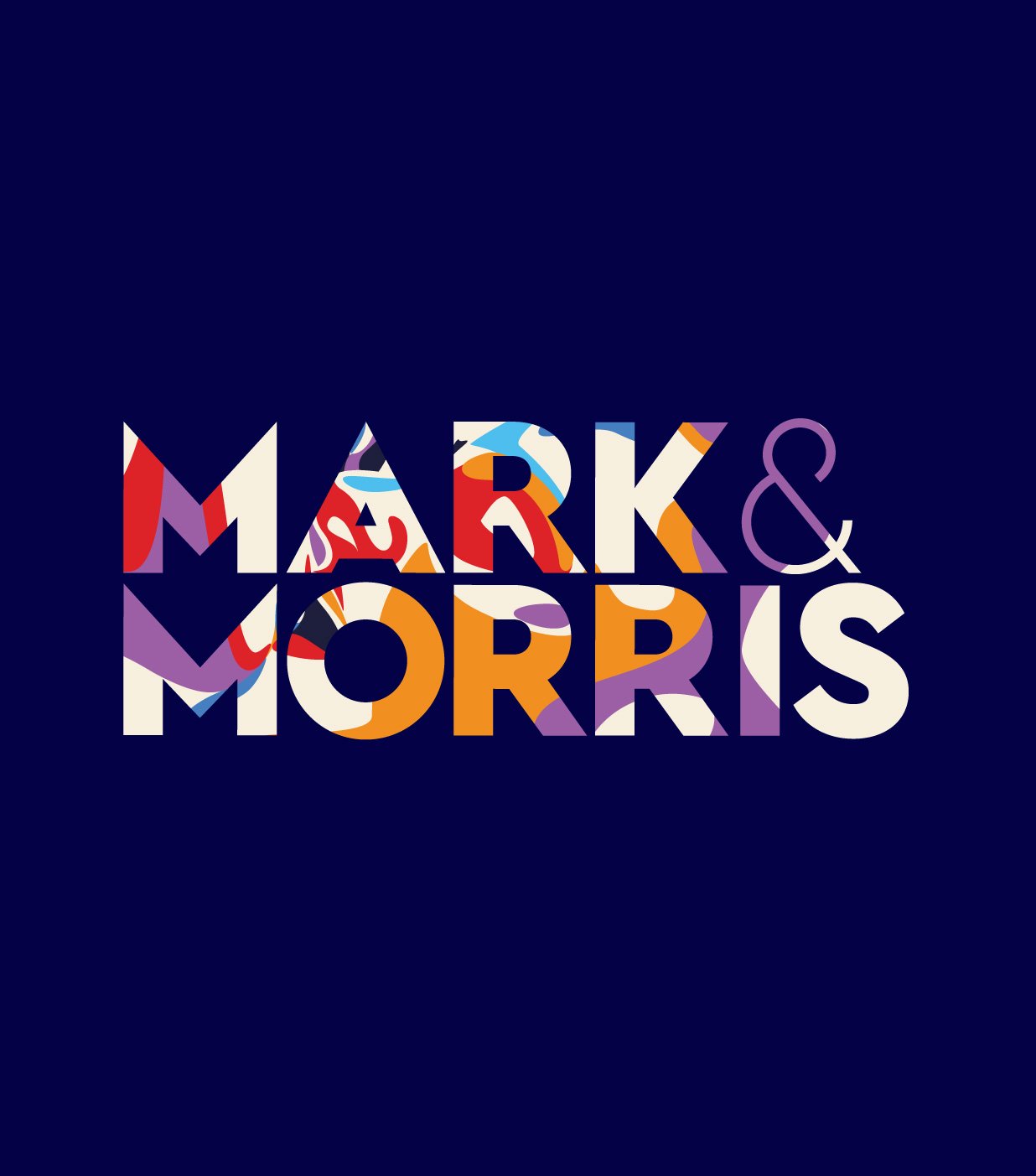
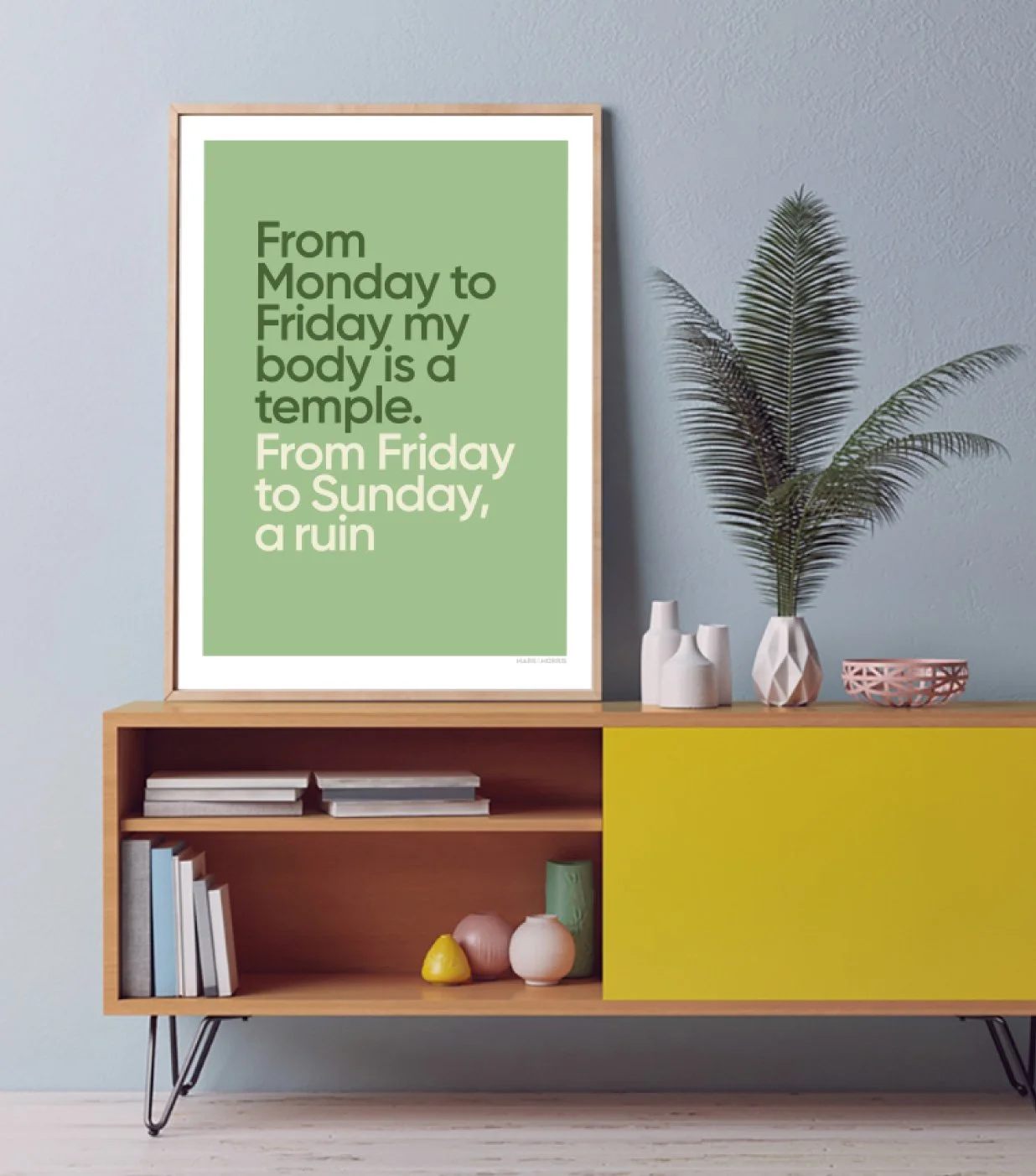
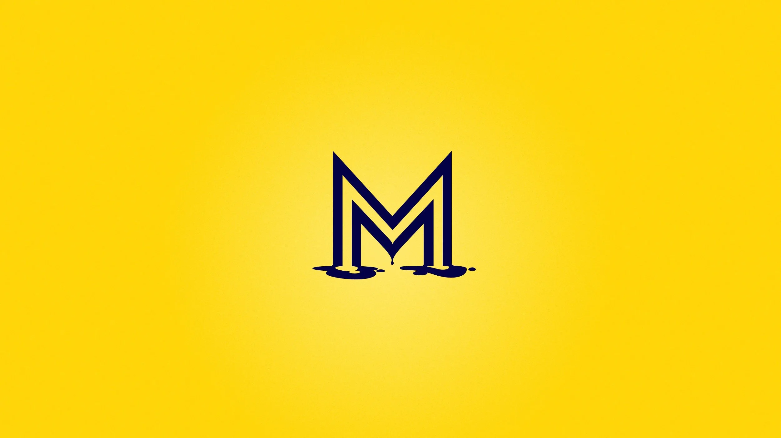
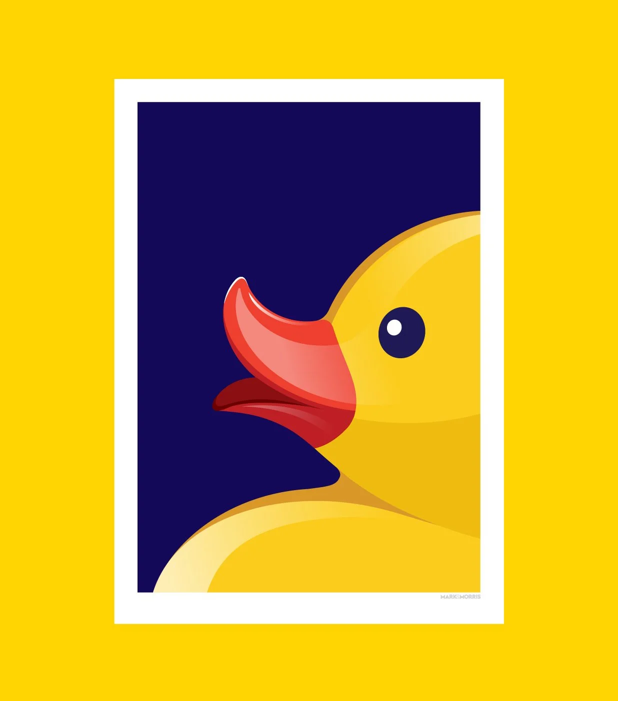
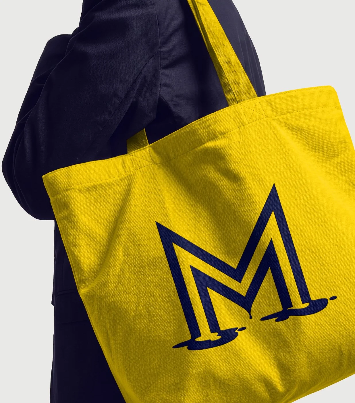
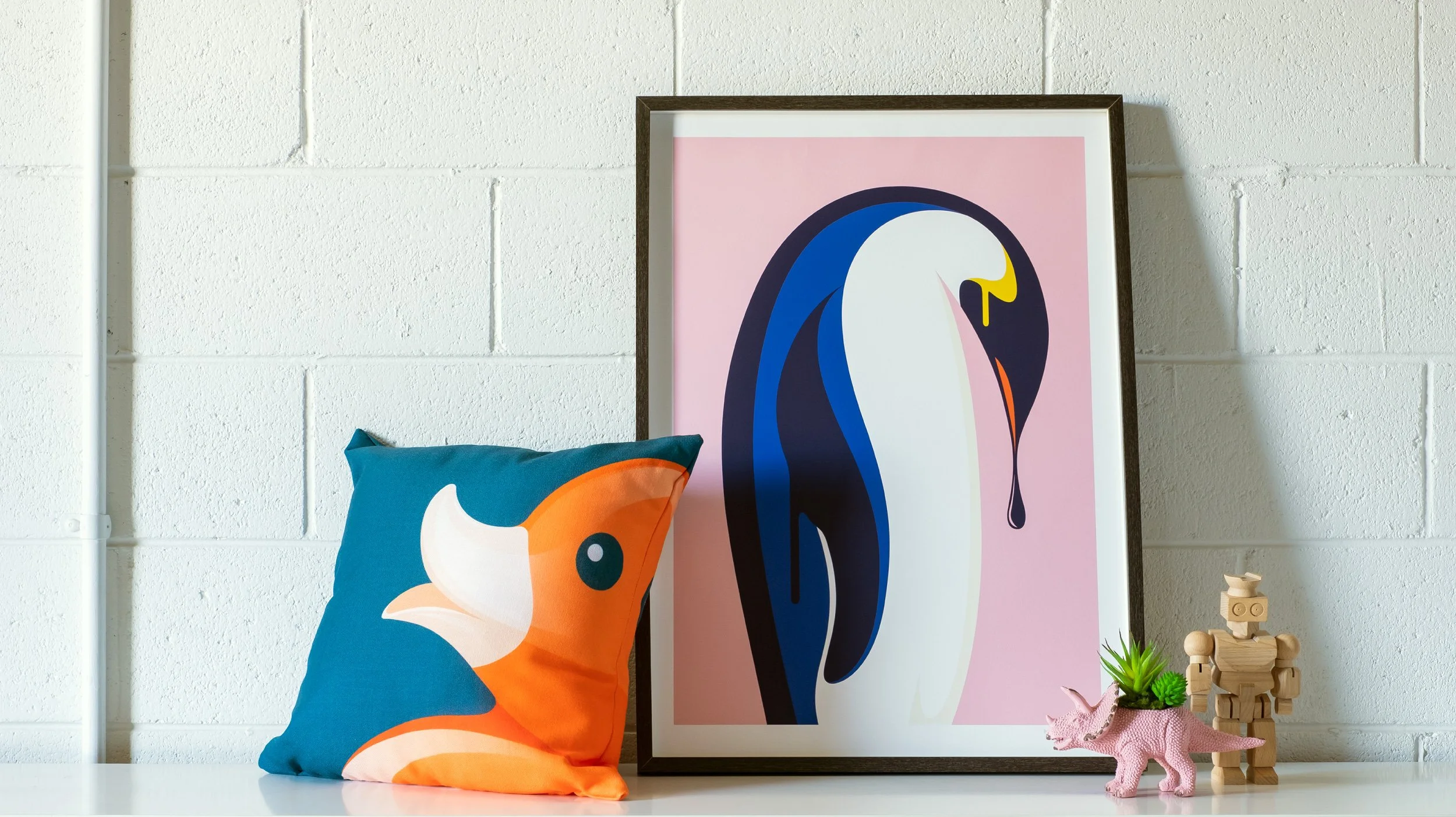
The brand identity and monogram were as fearless as its audience. The artworks themselves, vivid and cheeky, range from close-cropped rubber ducks to orca whales in fishbowls to melting portrait faces, each one a conversation starter. This branding and visual identity design with its volume turned all the way up.
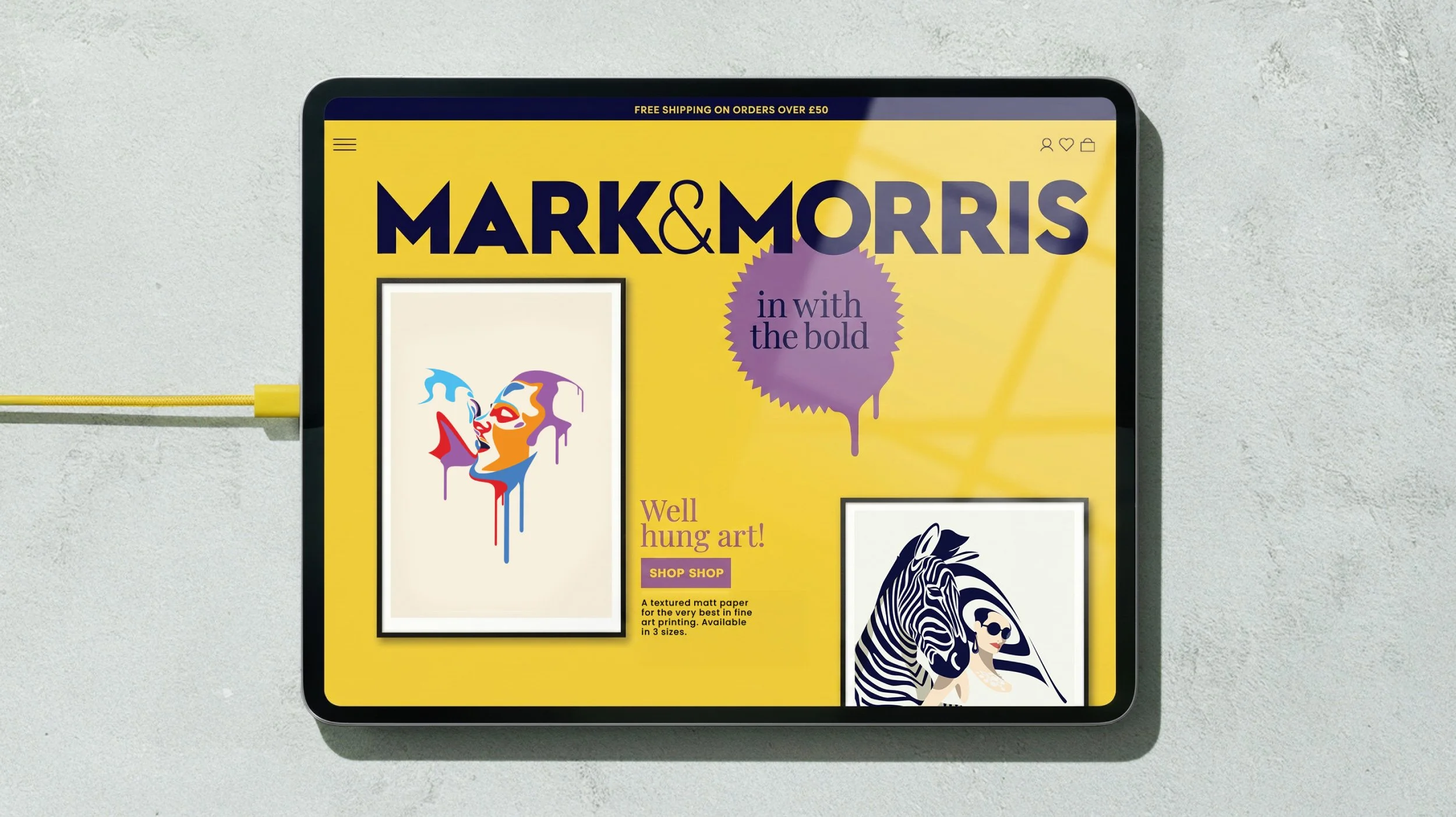
The brand's digital presence was designed to feel as curated as a gallery and as fun as a party. Mark & Morris doesn't whisper. It walks into the room and owns it. Exactly the kind of brand identity design that reminds you what happens when you stop playing it safe.