
You don’t need to shout
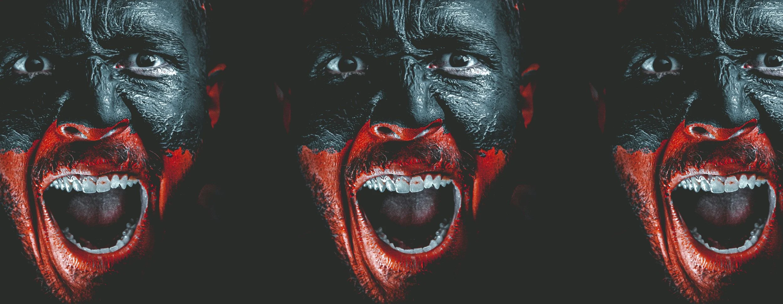
You don’t need
to shout
One of the first things I do when starting a branding or packaging project is line every competitor up side by side.
Not to copy them.
To understand the conversation they're already having.
Because good design doesn't exist in isolation. It exists in context.
Clients will often come into a project with understandable assumptions.
"Can we make the logo bigger?"
"Can we brighten the colours?"
"Can we add another claim?"
"Can we make it stand out more?"
They're all reasonable questions. Sometimes they're exactly the right thing to do.
But not always.
The answer depends entirely on what everyone else is doing.
Imagine walking into a room where everyone is shouting.
Your instinct might be to shout louder.
Sometimes that's the right strategy. But often the person who speaks calmly is the one everyone listens to.
Packaging works in much the same way.
Every category develops its own visual language over time. Some become crowded with claims and promotional flashes. Others become minimalist. Some rely on photography. Others lean heavily on illustration. Certain colours become category codes that shoppers instinctively recognise.
Before making any design decisions, it's important to understand those patterns.
Only then can you decide which dials to turn.
If every competitor is using bright colours, perhaps a more restrained palette creates greater impact.
If every pack is stripped back and understated, perhaps introducing more energy is exactly what's needed.
If everyone is making the logo enormous, maybe hierarchy matters more than size.
There isn't a formula.
There's only context.
That's why great design is rarely about following trends or applying the same philosophy to every project.
It's about making informed decisions.
The best branding projects I've worked on haven't started with a visual style. They've started with a simple question.
What does this category need?
Not what do we like.
Not what's fashionable.
Not what won an award last year.
What does this particular brand need in order to be noticed, understood and remembered?
Sometimes the answer is simplicity.
Sometimes it's boldness.
Sometimes it's colour.
Sometimes it's restraint.
As designers, our role is to help clients navigate those decisions together. The strongest outcomes come from partnership—combining commercial objectives with creative thinking to find the right solution for the category, the audience and the brand.
Standing out has never been about turning every dial to maximum.
It's about turning the right dial at the right time.
Because in design, context isn't just important.
It's everything.